Download
1 / 2
30 likes | 102 Views
Proximity Items related to each other should be grouped closely together. Use white space to provide distance between unrelated items. DO NOT use a blank line between a title and story. If you want space between paragraphs, use the Space After function to Format Paragraph. Font Families

E N D
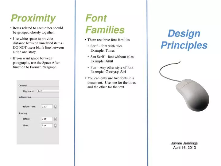
Proximity • Items related to each other should be grouped closely together. • Use white space to provide distance between unrelated items. DO NOT use a blank line between a title and story. • If you want space between paragraphs, use the Space After function to Format Paragraph. • Font Families • There are three font families • Serif – font with tales Example: Times • San Serif – font without tales Example: Arial • Fun – Any other style of font Example: GiddyupStd • You can only use two fonts in a document. Use one for the titles and the other for the text. Design Principles Jayme Jennings April 16, 2013
Contrast • You want to grab your readers attention. You can do this by adding visual interested to your page. • Make color, size, and different shapes. Make big things big andlittle things little. Make text dark and background light or vise versa. • Repetition • The document should look the same way throughout. Use the same founts and sizes. • Titles should be one size, text another. Use a similar graphic format throughout. • Use a similar color scheme throughout. • Alignment • Alignment creates a visual connection. There are 4 types of alignment. • Left-This is the most common. Use when your reader will use lots of text. • Right-This is a funky modern alignment used for titles. • Center-This one is boring. Center titles when you want to be formal. • Block- Used when doing news letter type articles. Gives you smooth edges left and right.