Download
1 / 11
110 likes | 219 Views
Learn about the importance of alignment in design principles and how to align elements effectively on a web page for a cohesive and professional look. Discover the impact of centered versus left-aligned elements and how to create strong visual connections through alignment. Explore various alignment strategies and their influence on overall design aesthetics.

E N D
Design Principles: Alignment Nothing should be placed on the page arbitrarily. Every item should have visual connection with something on the page.
Align elements along "hard vertical edges." • If instead of centering your text, you align the text on the left or the right, the invisible line that connects the text is much stronger because it has a hard vertical edge to follow.
A centered alignment creates a more formal look, a more sedate look, a more ordinary and oftentimes dull look
Alignment • Combine a strong flush left or right with good use of proximity and you will be amazed at how strong your work looks.
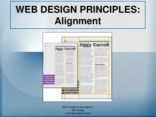
Alignment • Never center headlines over flush left body copy or text that has an indent. • Find a strong alignment and stick to it. If the text is flush left, set the heads, subheads, and paragraphs flush left. • If there are photographs or graphic images, align them with a text edge and/or baseline.
Alignment: ideas • Align image caption stories with the strong line of the photograph, which makes each stronger because of the stronger vertical edges this creates. • Lack of alignments is probably the biggest cause of unpleasant-looking documents. Our eyes like to see order; it creates a calm, secure feeling.
Alignment: ideas • Alignment helps create unity on the page. Alignment helps connect and unify all the elements on a page, which creates an ordered, clean look. • Breaking the principle of alignment can be a nice design trick by breaking the reader's expectations.
Killersites • Web design from scratch • The Brads • Alignment in a website