Download
1 / 2
20 likes | 70 Views
Learn about proximity, white space, font families, and key design principles like contrast, repetition, and alignment to enhance visual communication and create visually appealing documents. Understand how to apply these principles for better content presentation.

E N D
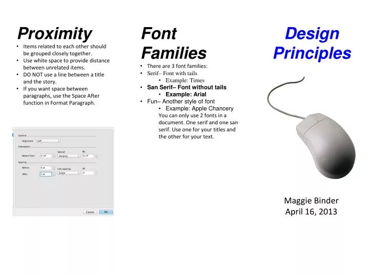
Proximity • Items related to each other should be grouped closely together. • Use white space to provide distance between unrelated items. • DO NOT use a line between a title and the story. • If you want space between paragraphs, use the Space After function in Format Paragraph. • Font Families • There are 3 font families: • Serif– Font with tails • Example: Times • San Serif– Font without tails • Example: Arial • Fun– Another style of font • Example: Apple Chancery • You can only use 2 fonts in a document. One serif and one san serif. Use one for your titles and the other for your text. Design Principles Maggie Binder April 16, 2013
Contrast • You want to grab your reader’s attention. • Add visual interest to your page. • Make color, size, and shape different. • Make big things BIG and little things little. • Make text dark and background light or vise versa. • Repetition • The document should look the same way throughout. • Use the same font and font sizes. • Titles should be one size, text another. • Use a similar graphic format throughout. • Use a similar color scheme throughout. • Alignment • Alignment creates a visual connection. • There are 4 types of alignment. • Left- This is the most common. Use when your reader will read lots of text. • Right- This is a funky, modern alignment. Use for titles. • Center- This one is boring. Center titles when you want to be formal. • Block- This gives you smooth edges left and right. Maybe use in a newspaper.